
“Life @ is a social assistant, not social media. It’s here to help establish a connection, then fall back & allow your new friendships to flourish.The aim of Life @ is not to addict users with any of the tricks other platforms use- ‘like’ cycles, FOMO, or comment threads. More than anything, Tuple wants to hear the story of users making in-person, long-term connections with others offline.”
In 2018 I was invited to join a startup team as the graphic designer for their app. It very quickly became clear that what they actually needed was a UX designer, UI designer, researcher, copy writer, etc… So I started collecting hats and wore them throughout the course of the project.
The team aimed to create a social app for members of a specific church, with the aim to expand this service to any church, college, or company campus where members might struggle to make connections in person.
We asked:
In an organization with thousands of members, how does one make connections with fellow attendees/students/employees?
And explored:
A location-based app designed to alert members of others with similar interests upon entry to the building or campus they belong to will allow strangers to break social barriers and begin interacting with the other members more easily.
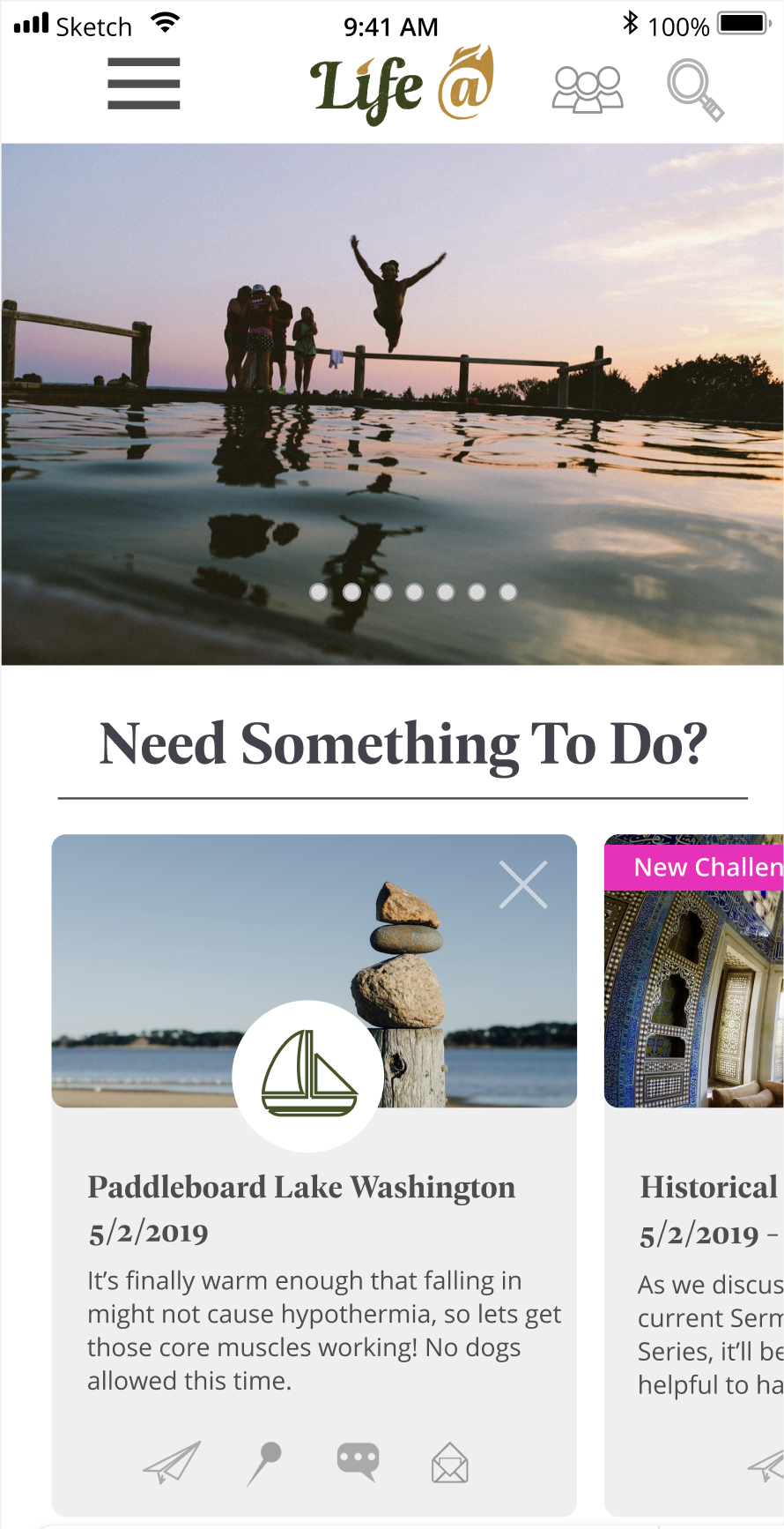
The dashboard of Life @, with 2 invitations relevant to the user’s selected interests.
The Research
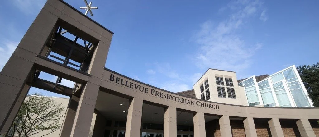
We began with a series of interviews. The church we were partnered with has 7 major departments, 4 of which handle weekly in-person concerns. We had contacts in each department and regularly consulted with them to ensure that each departments’ needs were being met by our app.
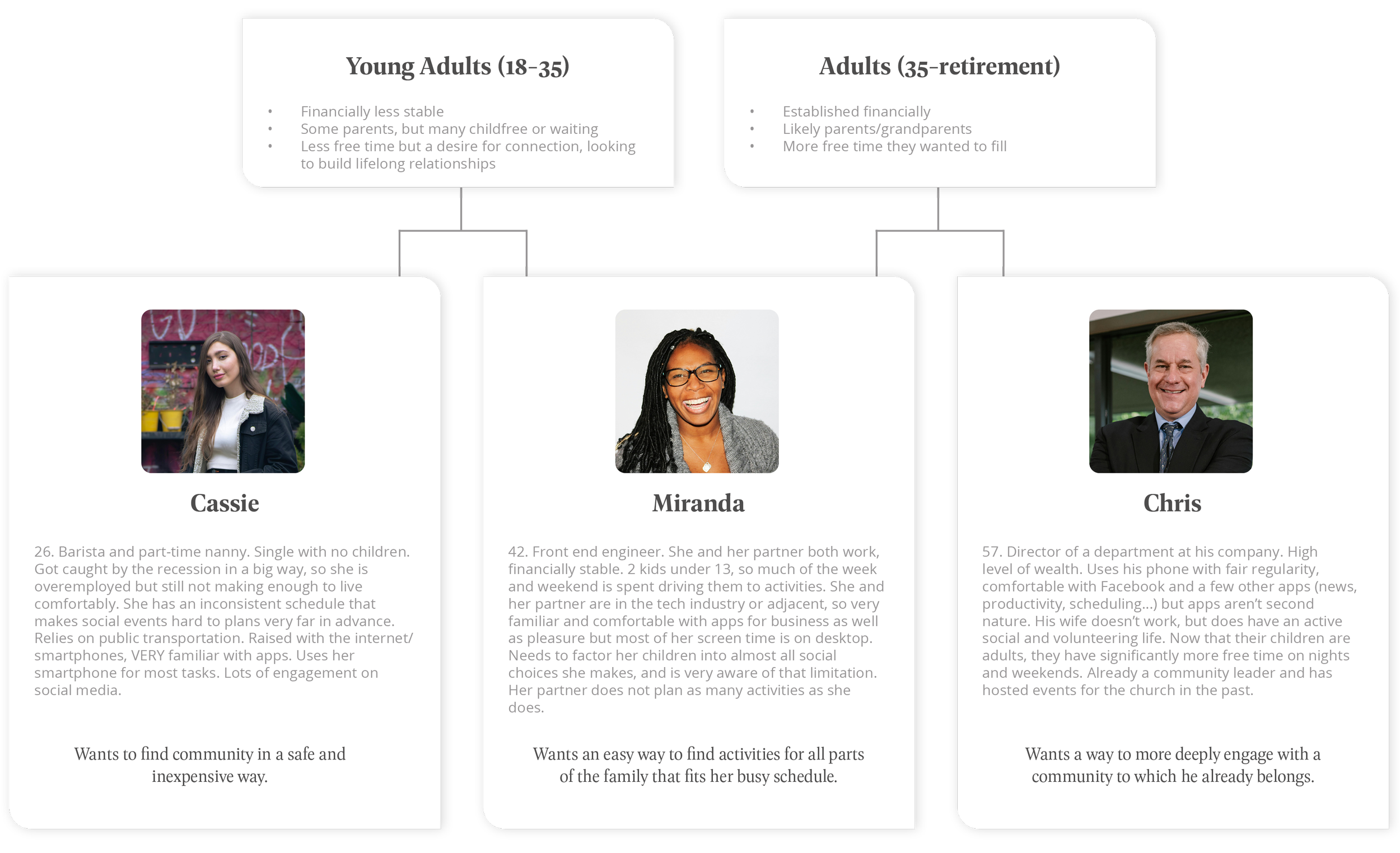
After the stakeholders in the church, we spoke to groups of 2 major age cohorts within the members: Adults and Young Adults. This org’s population has a higher than average level of tech literacy so we were less concerned with unfamiliar users and more with making sure that the specific needs of each age bracket were taken into account before we made anything. The interviews provided us with material to create 3 user profiles.
Each time we added a new element to the product or overhauled an old one we checked in with our department contacts as well as individuals to run tests. Our interviewees were gathered from within and without the church.
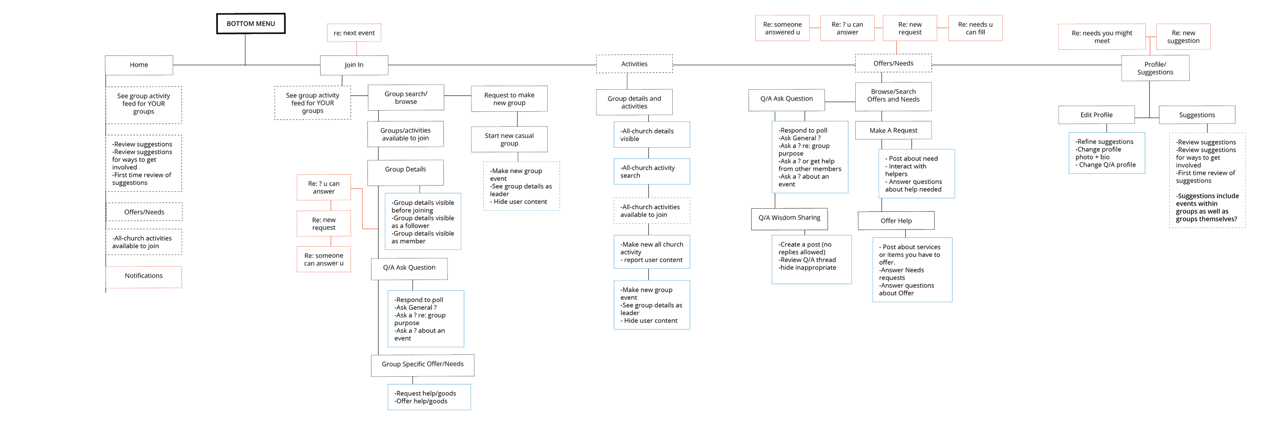
Life @
With guidance from our BelPres contacts and the feedback we got from our user interviews, we determined that the pillars on which this app should be built were Adventures, Groups, and Church Events. Each of these categories allowed users to plan or join social events taking place in person with other members. The activity suggestions served by the app were based either on a user’s selected interests, or the calendar run by the church itself.
We felt that self-directed user input was pivotal in answering the question posed at the beginning of this project. In an organization where everyone comes together for “the same reason“, i.e. shared religion, employer, or school, individual interests need a way to shine through. We decided to center those in the functionality of the app.
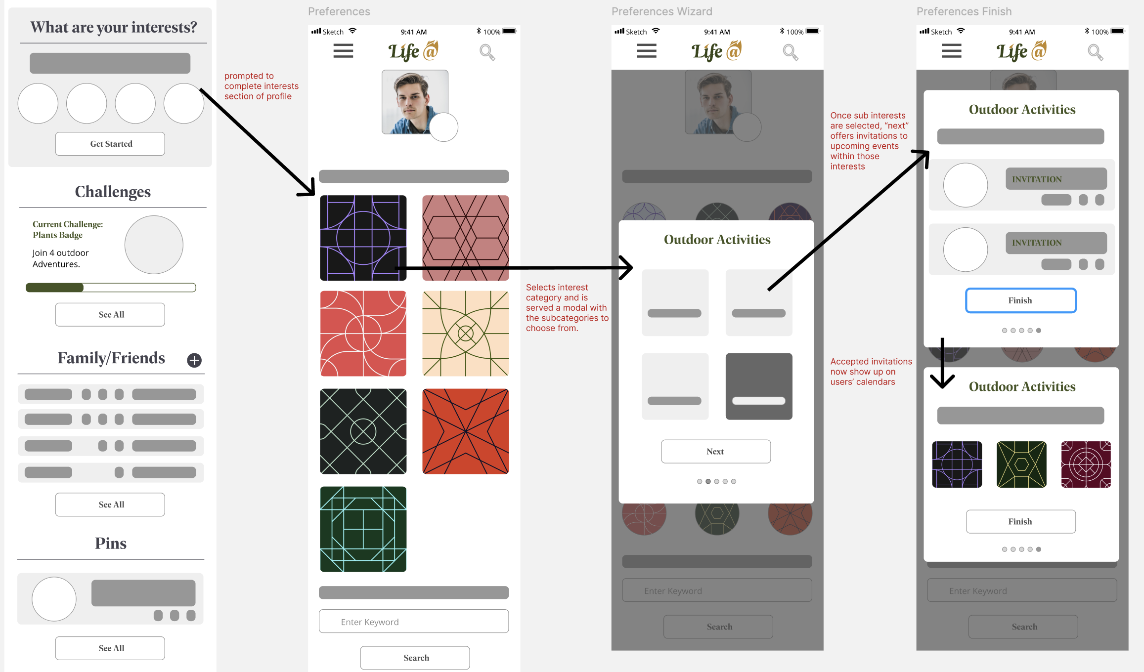
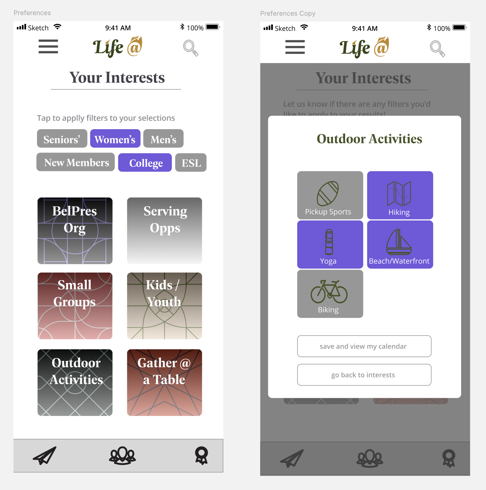
Users were prompted to select from a list of interests and filters in order to specify the types of user-generated events and groups they wanted to receive invitations to.
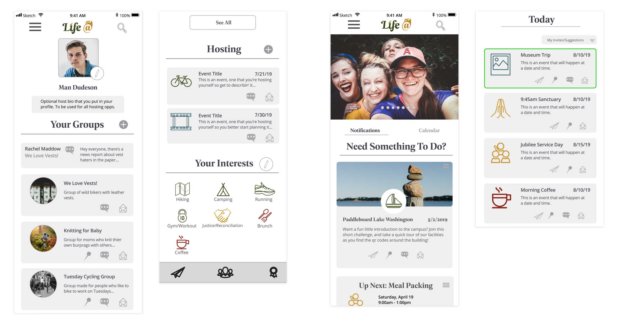
The profile and home pages, showing membership to multiple groups and a range of interests.
Once a user had completed their profile, Life @ could offer suggestions and invitations for groups or adventures related to their interests.
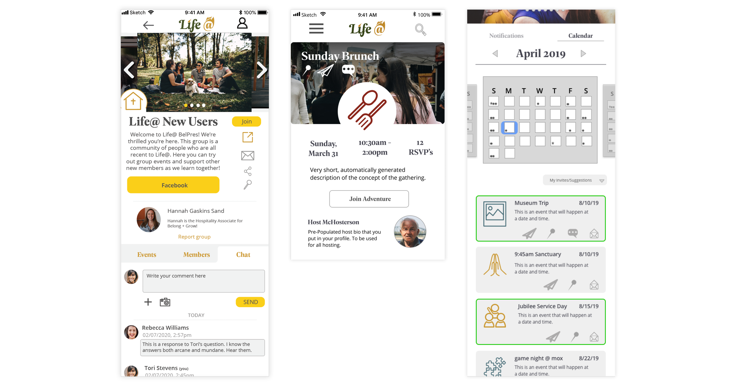
Groups were regulated by their creators, and membership by default needed to be approved. They offered public message boards to communicate with other members and in-group events.
Adventures, by contrast, were open calls to whomever might be available to join with shared interests. Membership to a group was not required.
Group events, all church events, and accepted invitations to adventures would appear and could be managed in the Calendar tab of the home page.
Based on user feedback during our interviews, we started making plans to include needs-based features such as a BuyNothing-style feature we called Offer/Need, and a mentorship tab. This would allow users to go to a more manageable source than the internet at large to look for and give advice regarding their careers, hobbies, or other areas of life that needed answers.
Unfortunately, these plans were being made in the first months of 2020. Shortly after, the COVID-19 global pandemic halted all in-person contact, and the Life @ project was shelved indefinitely.
The Brand
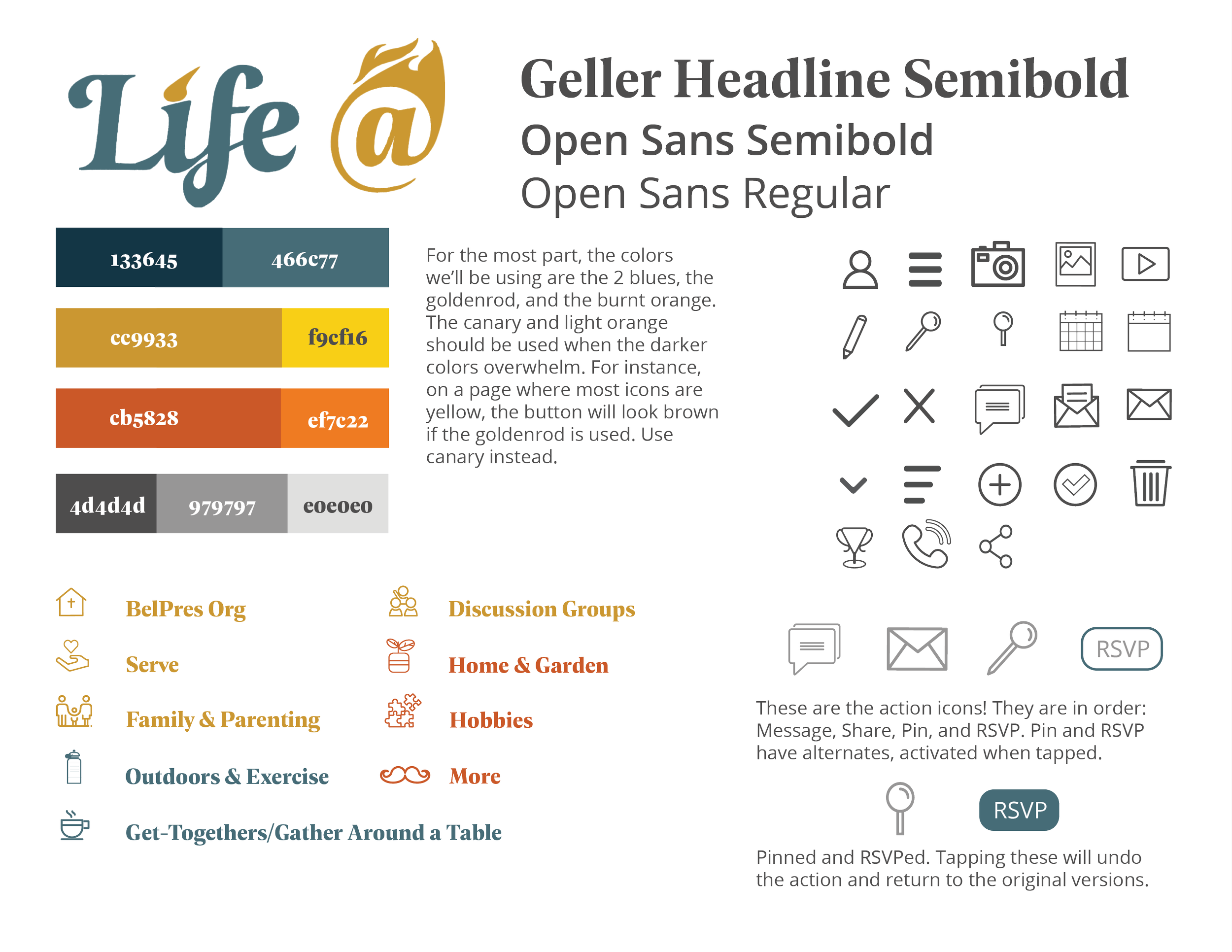
One-page style sheet
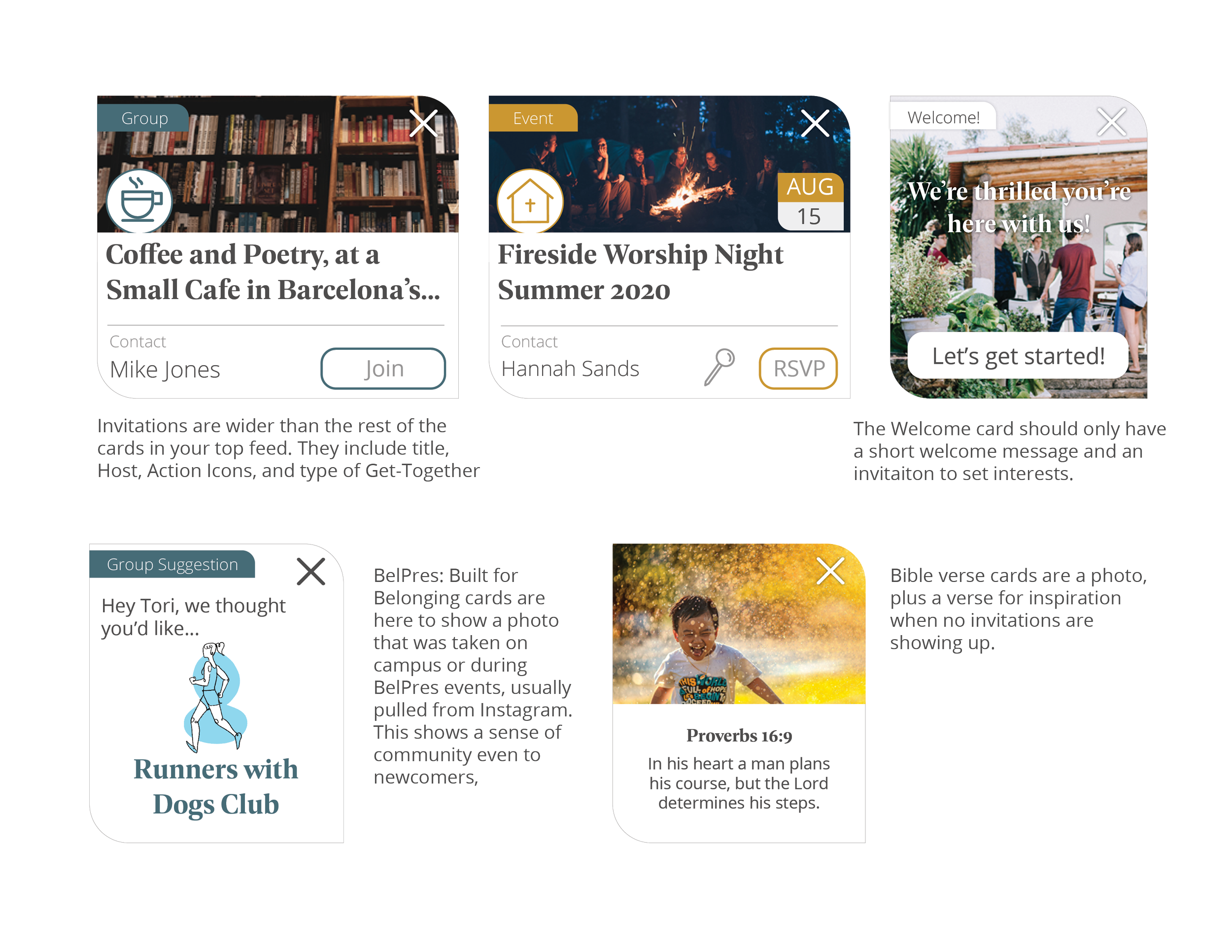
Examples of cards
Because our first partner organization was a church, we aimed the brand and UI at appealing to and serving that population. While Young Adults and Professional Parents do make up a good proportion of the membership at BelPres, by far the largest user base in the church would be in the Older Generation. The style guide for BelPres asks that printed material stays at about 14 pt font, in order to accommodate aging eyes.
The cards took on a leaf shape, to evoke a sense of friendliness and to echo the popular Christian iconography symbolizing growth and peace.